
EMPIRE (AUGUST 2007) /
SIGHT & SOUND (SEPTEMBER 2012)
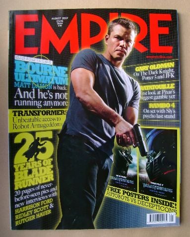

The mastheads of these magazines are all placed at the top to allow enough space for the main image to be shown. Empire's title uses a sans-serif font to give the cover a more modern aesthetic while, in contrast, Sight & Sound uses a serif font which makes for a more vintage and dated feel. Sight & Sound's masthead has a 3D effect applied to it with a white outline surrounding each letter, while Empire's is a single block colour and is typed in capitals.
Moving onto main images, the most obvious is the large picture of Matt Damon in the foreground of Empire. Some common conventions of thriller movies are shown in this image, such as having a gun positioned in a way that suggests he's pursuing someone. Fans of thriller movies, the Bourne series, and Matt Damon will see this cover and automatically be drawn to purchase it. The Sight & Sound main image is more complex, as it is a central graphic composed of lots of different, smaller pictures. Photographs of old-fashioned recording devices are interspersed with iconic scenes from popular movies, with a black and white filter applied over the whole thing. All of these features come together to further encourage a vintage feel, just like the masthead.
In terms of secondary images, Empire includes some pictures of free posters that are found inside, which also counts as a selling point for the magazine. Giving the reader an incentive to purchase the magazine makes it more likely that the articles inside will be read, exposing the films covered to a wider audience. Selling points can also be achieved through text. For instance, the Sight & Sound magazine says that many famous directors will be giving their opinions on the greatest films of all time. This will appeal to fans of directors like Scorsese and Tarantino, making it more likely for them to buy the magazine. Empire also uses phrases such as "world exclusive" and "never-before-seen" to promise their readers a unique experience from that of other film review publications.
Although at first glance, Sight & Sound's cover feels the most cluttered, it's really only focusing on one main story. Empire, however, uses cover lines for lots of different articles to show the variety of films that are covered. Both of these methods appeal to different audiences. Some people prefer to read about a diverse range of subjects, while others like reading just one that goes into a lot of detail.
Where Sight & Sound uses a black and white filter to create a more dated look, Empire applies a neon-looking glow to the edges of the main text and images to give the cover a futuristic vibe. This also helps in establishing the main focus of the issue as a thriller film, since a lot of these movies are set in urban, modern situations.
Both Empire and Sight & Sound uses red as a contrast colour, except the latter is more minimalistic in terms of palette. Empire's title is red but uses different colours within the body to keep encouraging the idea of a contemporary magazine, whereas Sight & Sound uses few colours to draw attention to key points and features.
Both Empire and Sight & Sound uses red as a contrast colour, except the latter is more minimalistic in terms of palette. Empire's title is red but uses different colours within the body to keep encouraging the idea of a contemporary magazine, whereas Sight & Sound uses few colours to draw attention to key points and features.
No comments:
Post a Comment